Brand Anarchy: Why Ditching the Style Guide Is the Boldest Move a Company Can Make
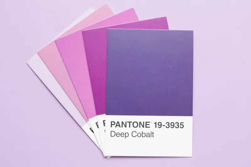
For decades, the style guide was corporate gospel. Pantone codes. Approved typefaces. Logo clearance zones measured in millimeters. Brand managers guarded these documents like they were the Dead Sea Scrolls, and any designer who strayed got a passive-aggressive Slack message before lunch.
But something weird is happening in boardrooms and creative studios across America. Forward-thinking companies — from scrappy Brooklyn startups to household-name consumer brands — are quietly torching their rulebooks. Not out of laziness. Not out of budget cuts. Out of pure, calculated rebellion.
Welcome to the era of brand anarchy. And honestly? It looks incredible.
The Rulebook Was Always a Lie
Here's the thing nobody in a brand strategy meeting wants to say out loud: rigid visual identity systems were never really about authenticity. They were about control. The idea that a brand could be distilled into six hex codes and two typefaces was always a fiction — a comforting story told to justify expensive agency retainers.
The brands that actually connect with people have always leaked outside their own borders. Think about how Nike's visual language has shapeshifted across decades, from clean athletic minimalism to chaotic streetwear collabs that look nothing like each other. Or how Liquid Death — a canned water company, let's not forget — built an entire identity on heavy metal absurdism that violates basically every conventional beverage branding rule. Their cans look like they belong at a Slayer concert. Their audience is obsessed.
Visual unpredictability, it turns out, reads as personality. And personality is the one thing no style guide can manufacture.
When Inconsistency Becomes a Strategy
The psychology here is genuinely fascinating. Research in consumer behavior consistently shows that audiences extend more trust to brands that feel human — and humans, by definition, are inconsistent. We change our minds. We experiment with our look. We go through phases.
When a brand behaves too perfectly, too consistently, the human brain registers something slightly off. It's the visual equivalent of the uncanny valley. Everything is technically correct, and yet something feels hollow.
Contrast that with a brand like Depop, the resale fashion platform that became a Gen Z obsession partly because its visual communication looked like it was assembled by a teenager with a Risograph printer and a color theory phobia — in the best possible way. Asymmetrical layouts. Clashing palettes. Fonts that had no business being on the same screen together. It looked alive.
Or consider how Spotify's annual Wrapped campaigns have evolved into something almost aggressively chaotic — bold color combinations, data visualizations that feel like fever dreams, typography that changes dramatically year to year. Each iteration looks different from the last, yet somehow it's unmistakably Spotify. The chaos is the brand.
Controlled Spontaneity: The New Creative Discipline
Here's where it gets nuanced, because total visual anarchy without intention is just a mess. The brands doing this well aren't abandoning strategy — they're replacing rigid rules with flexible principles.
Think of it less like a style guide and more like a jazz ensemble. There are still underlying structures, a shared musical vocabulary, an agreed-upon key. But within that framework, every player is encouraged to improvise, respond to the room, and push into unexpected territory. The result feels alive precisely because it wasn't entirely scripted.
Some companies are formalizing this approach through what designers are calling "living brand systems" — identity frameworks built around adaptable elements rather than fixed ones. Color palettes with wide ranges instead of single approved values. Modular typographic systems that can be remixed. Illustration styles defined by mood rather than strict visual rules.
Brooklyn-based agency Franklyn has been vocal about this philosophy, building brand systems for clients that deliberately include what they call "tension zones" — spaces where visual elements are meant to clash productively. The discomfort, they argue, is what makes people stop scrolling.
The Risk Nobody Talks About
Let's be real: this approach isn't for everyone, and it can absolutely go sideways.
When Gap famously tried to update its logo in 2010, the internet revolted within days and the company reversed course in under a week. That wasn't bold brand evolution — it was a change that felt disconnected from everything the audience had come to associate with the brand. The lesson wasn't "never change." It was that change needs to feel like it comes from somewhere authentic, not from a conference room trying to seem relevant.
The brands that pull off visual chaos successfully have usually built up enough genuine cultural credibility that their audience trusts the experiment. They've demonstrated, over time, that the weirdness is real — not a calculated attempt to seem weird.
There's also a real conversation to be had about who gets to be "chaotic." Established brands can absorb the risk of visual experimentation because they have equity to burn. Smaller businesses and especially brands from marginalized communities often face harsher judgment for the same creative risks. The freedom to be "interestingly inconsistent" isn't equally distributed, and anyone serious about brand anarchy should sit with that.
What This Means for Makers and Designers
If you're a designer, an independent creative, or a maker building your own brand identity, this shift is genuinely liberating news. The pressure to nail down a "cohesive aesthetic" before you launch anything has always been partially paralyzing — and increasingly, it's also unnecessary.
Some of the most compelling personal brands in the DIY and maker space right now look like creative explosions. Ceramicists whose Instagram grids mix product shots with memes with process videos with political posts. Illustrators who shift between radically different styles depending on what they're feeling that week. Zine makers whose visual language evolves issue by issue.
These creators aren't failing at brand consistency. They're succeeding at something more valuable: they're being real.
The style guide told us that brands need to be controlled, predictable, and safe. But the most exciting thing happening in design culture right now is the collective realization that audiences don't want safe. They want alive.
So tear up the rulebook. Or better yet, set it on fire and see what you make from the ashes.